Wednesday, April 16, 2014

DOQQ


A digital orthographic quarter quad combines the characteristics of an aerial photograph and those of a traditional map. Most go through a process of georeferencing and orthorectification. Above is one of Delaware.
 http://www.wr.udel.edu/cb/characteristicsandsamplegismaps.html

Index Value Plot

Plot of monthly PDO values.

In an index value plot, we have index values being compared as opposed to absolute or total values.  In our example graph we are basically measuring seismic activity in a region of the Pacific Ocean.  With the years on the bottom, we see that all years with a positive index, one that is above zero, we have more than average activity and that every year below zero we see less than average activity.  The reason that the average is zero on this graph is because we have standardized the variable.  Thus, our graph essentially measures how far above or below average a certain year was as far as quantity of seismic activity goes.

http://www.jisao.washington.edu/data/pdo/

PLSS map


The PLSS maps were the first type of cadastral map ever created in the United States or even any modern country. It has been readily updated over the past couple hundred years or so.

http://en.wikipedia.org/wiki/Public_Land_Survey_System

Parallel Coordinate Graph

para_example_1.png
A parallel coordinate graph places data on a coordinate grid as a line or profile. The lines overlap and a
reader is able to make inferences about the relationship of the data.

http://stn.spotfire.com/spotfire_client_help/para/para_what_is_a_parallel_coordinate_plot.htm

Nominal Area Choropleth Map


These types of maps show how areas compare to each other using nominal data displayed on the map. The map above shows data on the distribution of college basketball players.

http://go.owu.edu/~jbkrygie/krygier_html/geog_353/geog_353_lo/geog_353_lo07.html

Box Plot


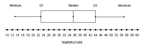
 A box plot, also called a box and whisker plot due to the extensions away from the box referred to as the whiskers, shows five points of data: the median, the first and third quartiles, and the minimum and maximum values.  On our box plot, we are measuring temperature and can see that we have a median temperature of 36 degrees, which is the line, usually closer to the center of the box.  The actual box represents the middle 50 percent of data, saying that 50 percent of the temperatures were found between 23 and 44 degrees.  The extensions away show the relative max and min, 55 and 13 degrees respectively.

http://weatherstories.ssec.wisc.edu/stories/armistice_day/climate.html

Unstandardized Choropleth Map


Choropleth maps contain some type of data displayed over and areal average. The data in unstandardized versions of these maps contain unorganized and unranked data. Above is unemployment data in January in the U.S.

http://www.creativeclass.com/_v3/creative_class/2009/03/12/state-unemployment-map/