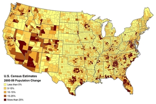
Above is the estimated population change for U.S. counties from the years 2000-2009. Each of the five colors on the map represent a range of percentage change in population and each county has one of these colors filled in on the map. Because the map portrays areal data (the counties) and the data is split up into groups, it can be classified as a classed choropleth map. Most of these maps usually contain four to seven groups.
No comments:
Post a Comment