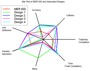
The type of map shown above is one of the most useful when attempting to explain concepts. Each piece of data is spread apart from each other such that, the closer each individual piece of data is to each other the more closely related the data points are. It can show multiple variables in one chart and the distance between each other on the chart is often conveyed using colored lines.
http://en.wikipedia.org/wiki/Radar_chart
No comments:
Post a Comment